Crisis Education
COVID-19 Response
Rapid-response public health training.



About the project
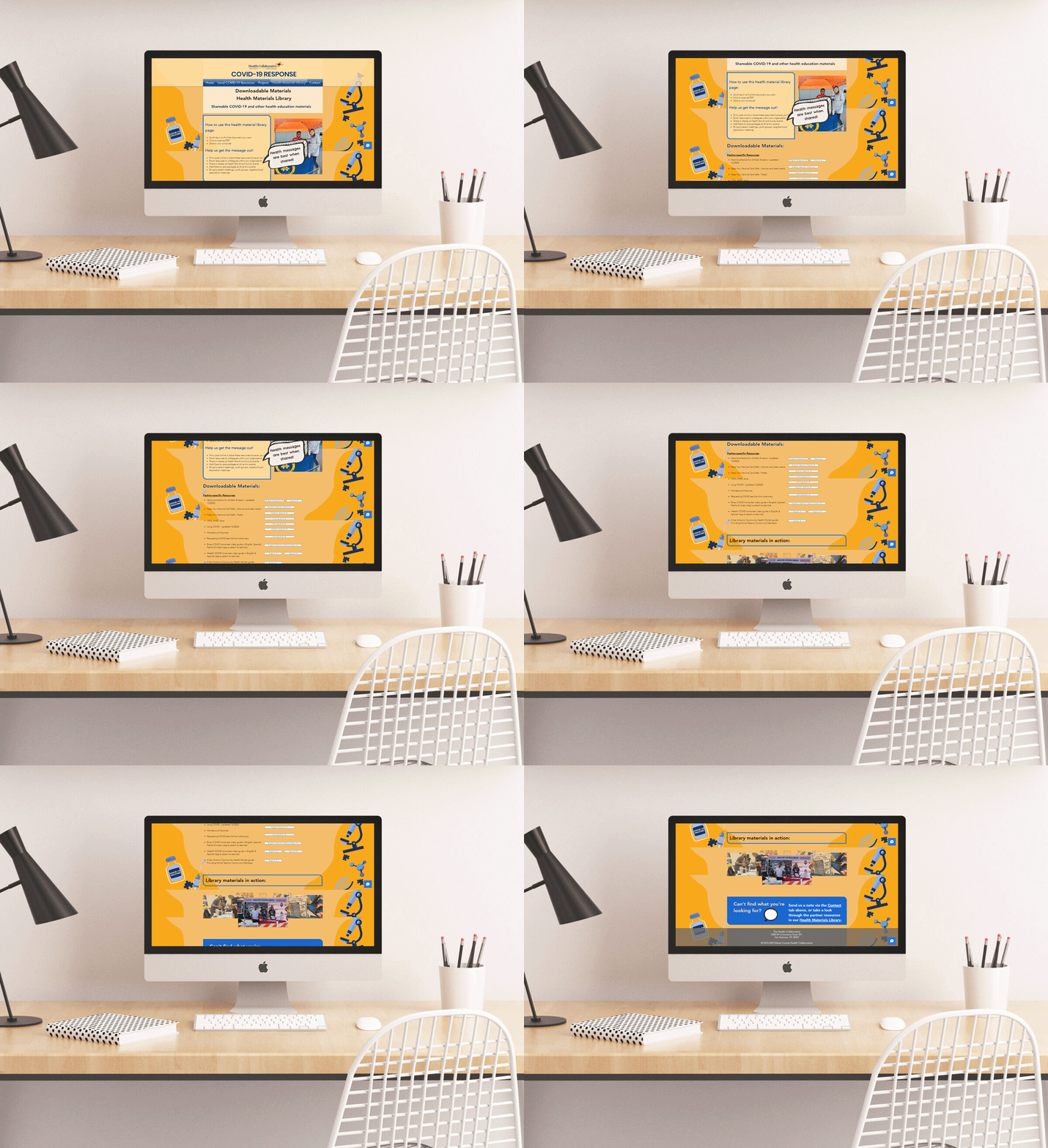
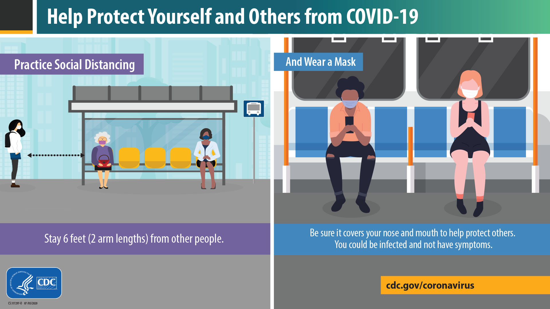
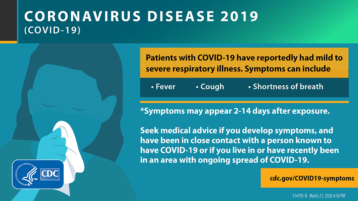
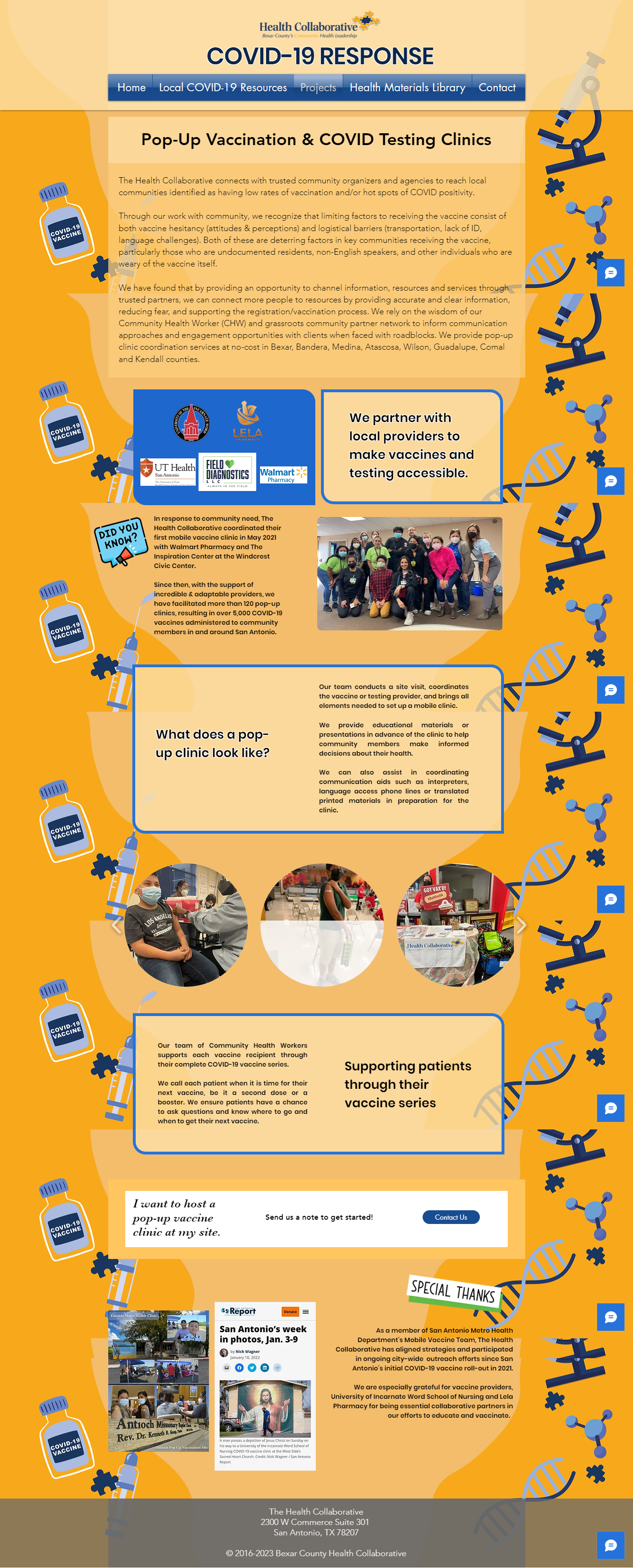
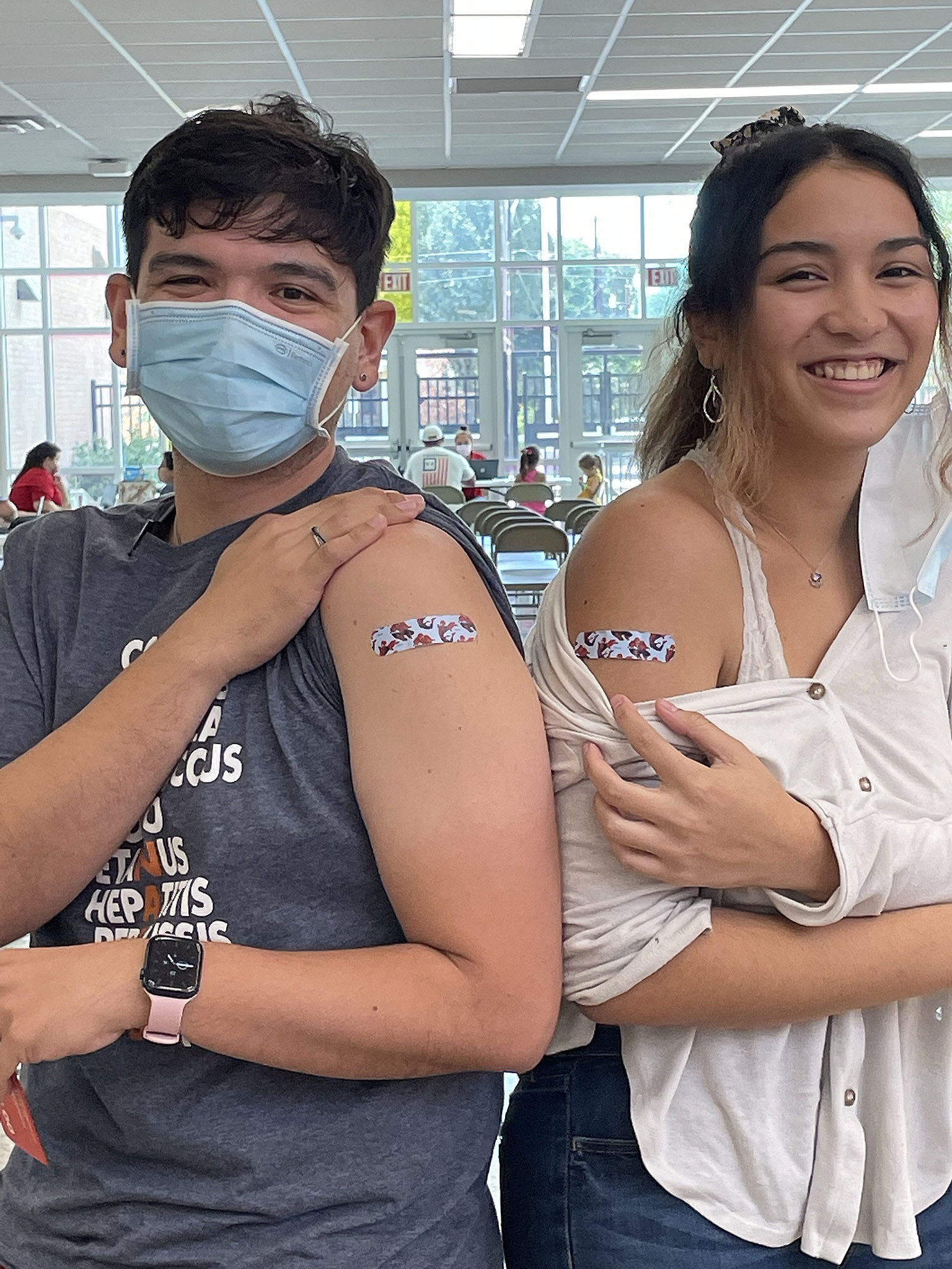
The project was a multistage team collaboration in effectively utilized color and iconography to communicate vital information about COVID-19 and available resources and education about safety precautions during the pandemic. It was rewarding to be a part of the positive impact it had on the San Antonio community, fostering awareness and promoting preventive measures in such a crucial time. We are proud that our efforts not only educated but also uplifted the community's spirit during challenging times.
How Low-Tech Can Effective Communication Go?
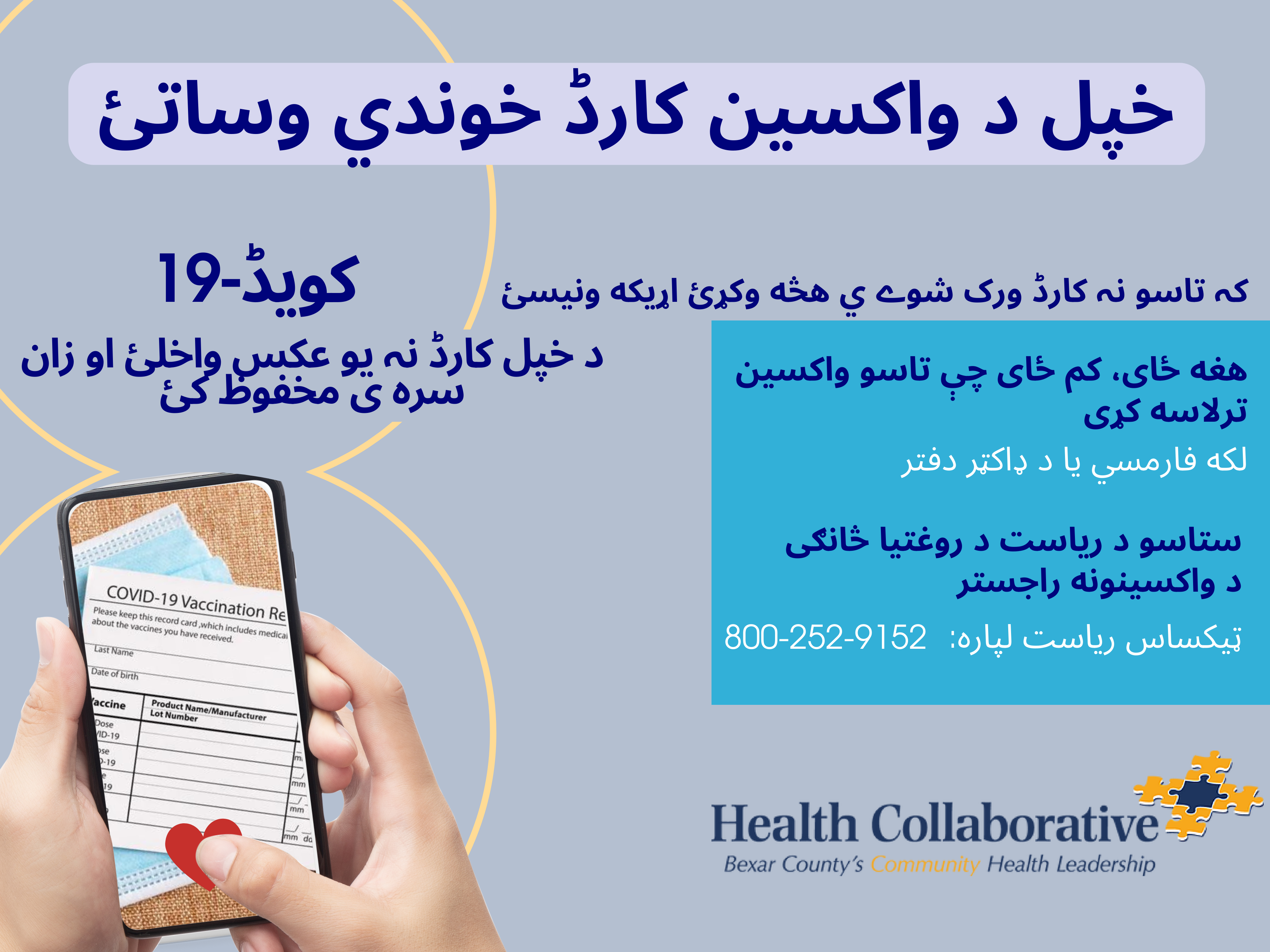
COVID19 Response project involved educational communication for members of San Antonio's Afghan refugee community.
In that environment, designing something technologically impressive wasn't the goal at all. Some learners had limited English proficiency, different levels of literacy, different cultural reference points, and different levels of access to technology.
So one of our strongest constraints actually became a useful design question:
How little technology can we requirewhile still communicating effectively?
Instead of assuming that more interactivity meant better instruction, we focused on clarity, visuals, translated materials, subtitles where appropriate, and communication that didn't depend heavily on English-language text. I became much more intentional about using visual information and making each communication unit understandable on its own.
We also had to think about accessibility very broadly. Accessibility wasn't just whether something technically met a digital standard. It included language accessibility, cognitive accessibility, technological access, and cultural context.
That forced creativity in a different direction. Rather than creating elaborate interactions, we might communicate a process through a small number of very clear visual steps that could work digitally, in print, or with a facilitator.